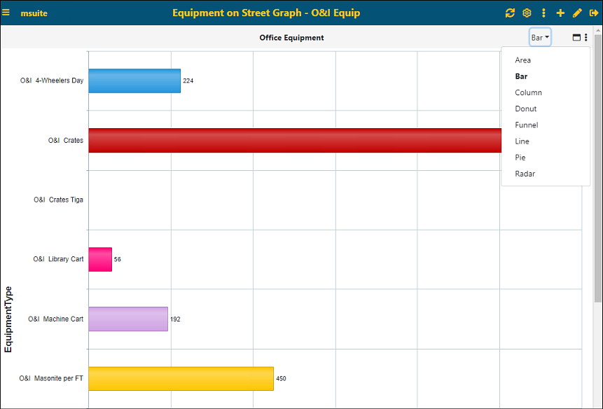
To format your report in a graph-type format as shown in Figure 78, under Components on the Properties screen choose one of the following options: Area, Bar, Column, Donut, Funnel, Line, Pie, or Radar.

Figure 78: Example of a Bar graph-type format
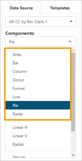
Figure 79: Chart type graph options
Notes to consider for this type of graph:
§ Choose the chart type in the dropdown list on the right.
§ If you set a date column as a Pivot Field, then you can choose Auto / Year / Quarter / Month (Aging for Pie/Donut) in Granularity By.
§ The option Summarize by allows summarization to be Average rather than just a Sum.
§ The Top will show the top 3,5,10,20 elements in either ascending or descending order.
§ If Show Chart as Percentage is selected, then the label will be shown as percentages of total.
§ If Show Total in Title is selected, then the total will show in the title.
Though there are many different graphs from which to choose, each has the same data requirements. As an example, for a graph-type option, Pie is chosen under Components in the graphic below (Figure 80).
Once Pie is selected, set the parameters on the Pie Chart Settings screen and the Details Settingsscreen. The “Settings” screen will correlate with the component type chosen: If Area was chosen, the settings screen would be titled Area Chart Setting instead.
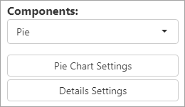
Figure 80: Choosing Pie shows these options
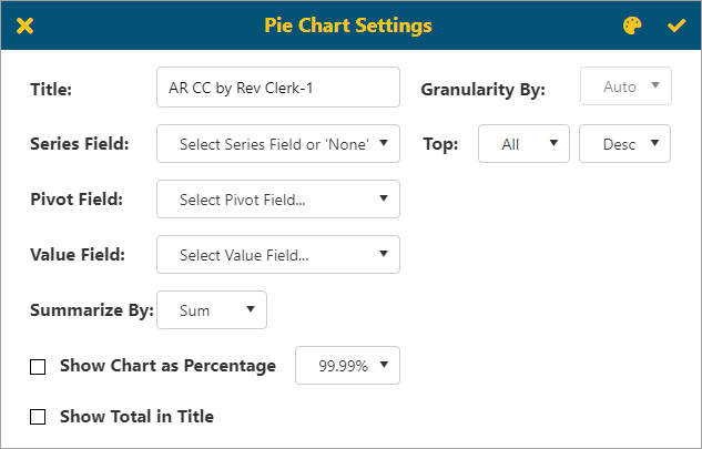
Figure 81: Pie Chart Settings screen
If you set a date column as a Pivot Field, then you can choose Auto / Year / Quarter / Month / Aging in Granularity By.
Aging will allow the user to set Boundaries, Inverse Colors and will give them ability to setup a Legend shown to the right of the chart. The available options are as follows:
§ None - Only shows chart.
§ Simple - Shows chart and descriptions.
§ Include Amount - Shows chart, description, and amount.
§ Include Percentage - Shows chart, description, and percentage.
§ Full Detail - Shows chart, description, amount, and percentage.
There is also the option to choose and customize the color
themes. See BI
Tool Adding and Editing a Color Theme. Click  to save.
Graph - Gauge
Gauge-type graphs are grouped together on the Components’ dropdown and include: Linear H, Linear V, and Radial. Users need to enter the boundary values in Gauge and will need to enter at least two values to build the graph successfully.
NOTE: Choosing Linear H allows users to have the linear gauge display horizontally. Likewise, Linear V allow users to have the linear gauge display vertically.
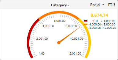

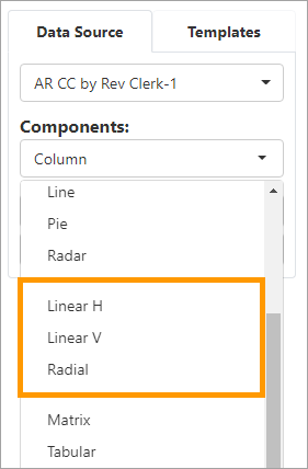
Figure 82: Gauge options on Components
Though there several different graphs in this category from which to choose, each has the same data requirements. As an example, for this graph type, Radial is chosen under Components in the graphic below. Once selected, the options for Radial display, which includes Radial Chart Settings and Details Settings. (If Linear H was chosen, the options would be titled Linear H Setting instead.)
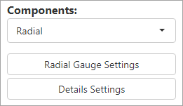
Figure 83: Radial options
Choose the Value Field from the dropdown. Enter the value in
the Input box and click Add to save the value. Click Remove to
delete it. Colors will be assigned from your BI Tool
Adding and Editing a Color Theme. The boundary values are dependent on
your report and field value. Click  to save.
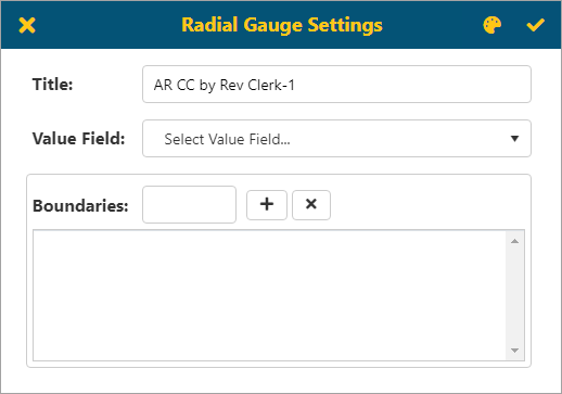
Figure 84: Radial Gauge Settings screen
Graph - Top List
The Top List is a chart that lists the Top 3, the Top 5, the Top 10 and the Top 20 for the criteria you choose.
When users choose Top List then will get a list of elements based on criteria selected
•If you set a date column as a Pivot Field, then you can choose Auto / Year / Quarter / Month in Granularity By
•User can choose Top 3, 5,10, 20 or All in either ascending or descending order
Top right corner has a Color Themes icon  , this will allow the user to choose or
customize a theme for this report/dashboard. See BI Tool Application Color Theme for
details on using this functionality.
When Top List is chosen as the Component type, the settings needed include Top List Settings and Details Settings.
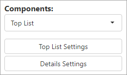
Figure 85: Top List options
The Top List Settings screen includes these fields.
Choose Top: enter which “Top List” this will be. There is the option to
change color themes through BI Tool Adding Editing a
Color Theme. Click  to save.
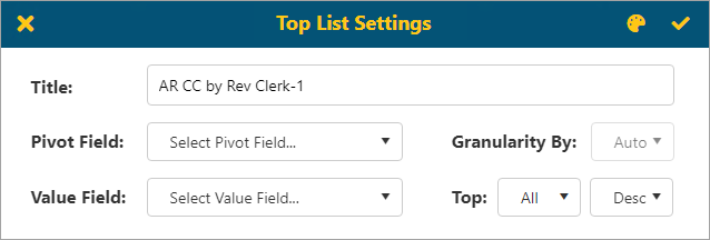
Figure 86: Top List Settings screen