Products
The Moving Software That Fits Your Needs
At MoversSuite, we understand that not all moving companies are the same. This is why we have developed a fully integrated moving software solution specifically designed to meet the needs of the moving industry overall.
Built upon MoversSuite Starter, MoversSuite Premier is designed to allow you to manage all move information while being able to plan out resources correctly and bill the right customer every time.
MoversSuite Ultimate is designed for the moving company that knows a fully integrated system from customer service to financials is a must. Building upon the functionality found in Premier, MoversSuite Ultimate closes the business process loop by integrating a full accounting system that is customized to address the unique needs of the moving industry.
Manage all aspects of a commercial move. Flow from an operation plan, to a bid to operations with a single entry.
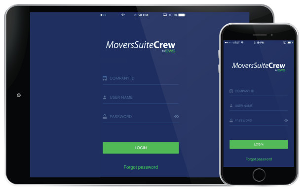
MoversSuite Crew by EWS
A truly mobile solution to help improve the overall moving experience.
Three Scalable Editions
- Only implement and use what you need today.
- Upgrade and add functionality as needed.
- No need to retrain entire staff.
Subscription Based
- No software to purchase.
- Built on best practices of the best movers.
- Only pay for the users you need.

Made for Movers
- Developed exclusively for the moving industry.
- Built on best practices of the best movers.
- Constant improvement driven by mover customer’s input.


