Dashboard/Edit Reports > Properties > Components
Within Properties > Components > Chart, there are the following options: Area, Bar, Column, Donut, Funnel, Line, Pie, or Radar. To view examples of these different options, click the either the topic or the “Fig.” number in the table below:
NOTE: The same data and criteria (Pivot Field, Summary Field, etc) are the same for each of the charts in the table.
|
Topic |
Image Number |
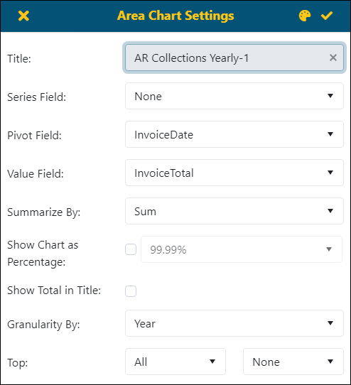
When choosing one of these options, when the option is clicked, a button will appear to define the criteria for that option. For example, choosing Area will prompt a button named Area Chart Settings, choosing Bar will prompt a button named Bar Chart Settings, and so on. Each of these will have the same fields and look like this:

Figure 85: Example of Area Chart Settings screen.
To create a chart type graph:
1. Enter a Title.
2. Optional, enter a Series Field.
3. Enter the Pivot Field.
4. Enter the Value Field.
5. Optional, set the type of percentage format to use in Show Chart as Percentage.
6. Optional, check Show Total in Title
7. Granularity By is available if the Pivot Date is a date.
8. Choose whether to list All or any of the Top 3, Top 5, etc. and then how to list results in the chart.
9. Optional, to choose the color theme for the chart. See BI Tool Adding and Editing a Color Theme.
10. Click the checkmark on the screen to save.
If needed, refine the data in the chart using the Details Summary button. See BI Tool Details Settings for instructions.
The following table describes each the field and function of each of the options available:
|
Icon / Field |
Description |
|
|
This will save the report/dashboard. |
|
|
Click to exit out of the Dashboard/Reports Edit screen without saving any of the changes made. This is useful if the user would like to try different Component settings but not save them. |
|
Title: |
Description will be used for title of this component in the report/dashboard |
|
Settings tab | |
|
Series Field: |
Optional. Set this to define data by the field chosen. A color chart will display detailing the chart color code used. See BI Tool Column > Figure 89 for an image of this feature in use. |
|
Pivot Field: |
The field set will be the column titles in the report.
NOTE: If you choose a date column as the Pivot Field, then you can choose Auto / Year / Quarter / Month in Granularity By. |
|
Value Field |
This is the value summarized in each cell |
|
Summarize By: |
The option Summarize by will add an extra column at the end of report and calculate the Average or Sum of each column. |
|
Show Chart as Percentage: |
If Show Chart as Percentage is checked, then the label will be shown as percentages of total in the format chosen. |
|
Show Total in Title |
If checked, the total will list in parenthesis in the Title. For example, AR Collections Yearly (Total: 123,456). |
|
Granularity By: |
If you set a date column as a Pivot Field, then you can choose Auto, Year, Quarter, Month, or Aging.
Aging will allow the user to set Boundaries, Inverse Colors and will give them ability to setup a Legend shown to the right of the chart. The available options are as follows: § None - Only shows chart. § Simple - Shows chart and descriptions. § Include Amount - Shows chart, description, and amount. § Include Percentage - Shows chart, description, and percentage. § Full Detail - Shows chart, description, amount, and percentage. |
|
Top: |
Choose to show All, the top 3,5,10, or 20 elements in either ascending or descending order. |