, this will allow the user to choose or
customize a theme for this report/dashboard. Please refer to the Color
Themes section to learn how to use this feature.
, this will allow the user to choose or
customize a theme for this report/dashboard. Please refer to the Color
Themes section to learn how to use this feature.
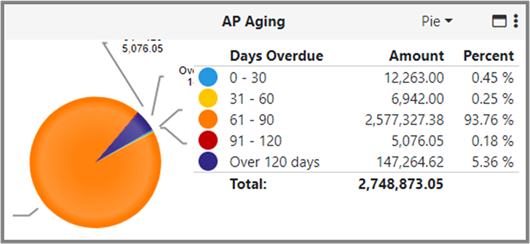
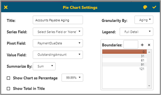
If you set a date column as a Pivot Field, then you can choose Auto / Year / Quarter / Month / Aging in Granularity By.
Aging will allow the user to set Boundaries, Inverse Colors and will give them ability to setup a Legend shown to the right of the chart. The available options are as follows:
§ None - Only shows chart.
§ Simple - Shows chart and descriptions.
§ Include Amount - Shows chart, description, and amount.
§ Include Percentage - Shows chart, description, and percentage.
§ Full Detail - Shows chart, description, amount, and percentage.
Top right corner has a Color Themes icon , this will allow the user to choose or
customize a theme for this report/dashboard. Please refer to the Color
Themes section to learn how to use this feature.
The resulting chart will look like this for Full Detail.