. This icon offers the choice of
color themes or the ability to customize a theme for this report/dashboard. Please refer to the Color Themes section to learn how
to use this feature.
. This icon offers the choice of
color themes or the ability to customize a theme for this report/dashboard. Please refer to the Color Themes section to learn how
to use this feature.
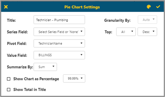
The Graph option will allow you to set up Graph Type, Graph Title, Series Field (which is used for multiple series in a chart), and Pivot Field (which is the field that the value chosen is grouped by) as well as the Value Field (which is the summarized value for each group). Option Include Graph decides whether the graph shows in the report.
§ Choose the chart type in the dropdown list on the right.
§ If you set a date column as a Pivot Field, then you can choose Auto / Year / Quarter / Month (Aging for Pie/Donut) in Granularity By.
§ The option Summarize by allows summarization to be Average rather than just a Sum.
§ The Top will show the top 3,5,10,20 elements in either ascending or descending order.
§ If Show Chart as Percentage is selected, then the label will be shown as percentages of total.
§ If Show Total in Title is selected, then the total will show in the title.
The top right corner has a Color Themes icon . This icon offers the choice of
color themes or the ability to customize a theme for this report/dashboard. Please refer to the Color Themes section to learn how
to use this feature.